The Making of Verdant Fang
Hello and thank you for playing Verdant Fang! Or if you haven't played it and don't care about spoilers, that's fine too, read on.
Although the game is not safe for work, this article should be completely safe for public viewing. However! Be warned that it does contain photos of real snakes and arachnids. I will also reiterate that there are spoilers for the entire game, and especially the ending. If you haven't decided whether you're going to play the game yet, consider reading down through "Room 7: Party", then skipping down to "Frequently Commented Comments."
We'll start by going over every room of the game in detail. Then I'll share some of the reactions I had to comments I received from the Strawberry Jam community. We'll finish with some overall thoughts about what it was like to make a game in a month.
Let's get right on with the first room.
Room 1: Start
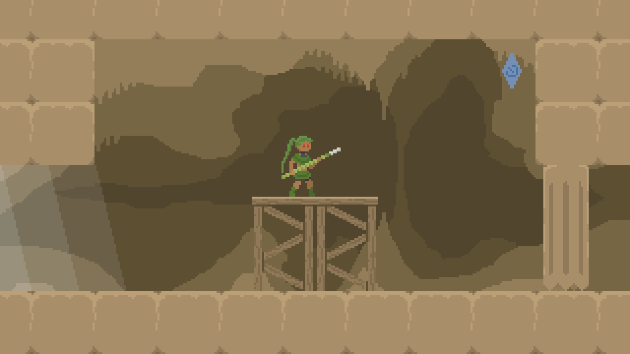
This room is necessary to make sure the player understands the controls for jumping and attacking before going into battle. Some players had trouble understanding that they were supposed to strike the switch with their weapon though, which I should have expected.
This room also doubles as the background for the title screen, so it needs to be laid out in an aesthetically pleasing way; the blue of the switch and the blue from the light flowing into the cave balance eachother, and I had to move the semisolid platform to the very center so it wouldn't look odd with the title screen menu (it was originally a little more to the right).
I made sure the transformation scene at the beginning was good and ready early on in the development process. It's useful to show a little bit of nakedness at the beginning, because it helps the player get attached to the character more easily, and establishes a precedent so you aren't too shocked when the boss is pantsless later on. It's also important to show the player that their weapon is a transforming snake, so they understand the cutscenes later. In fact, this is so important that I remind the player of it every time they visit the game over screen, by having Fang untransform and appear to revive the player with magic (which also builds attachment).
Speaking of the game-over screen, some players requested an auto-retry feature, so that dying doesn't break the flow of the game. Auto-retry is appropriate for games where you know exactly what you have to do and just need to execute it, for example SMW kaizo levels, or precision platformers like Celeste. I think it's a bit less appropriate for games with combat, and I intentionally break the flow when the player dies, because I want them to stop and consider if they want to change their strategy. Auto-retry tends to make players just rush into the next attempt hoping to get lucky—at least that's how I tend to play games with auto-retry. This reckless attitude dilutes the feelings of defeat when you die and victory when you survive.
That said, you can still make the retry loop faster, by pressing R to retry from the moment you get hit; you don't have to wait for the "press R to restart" message to appear. (Why does it say "restart" and not "retry"? It's a bit of a nod to a particular genre of Japanese indie platformers, where that message is a staple.) I don't point out this feature in-game because I don't want the player to skip the death-and-revive sequence without having seen it at least a few times, and many players discover this feature organically by themselves.
Room 2: Den
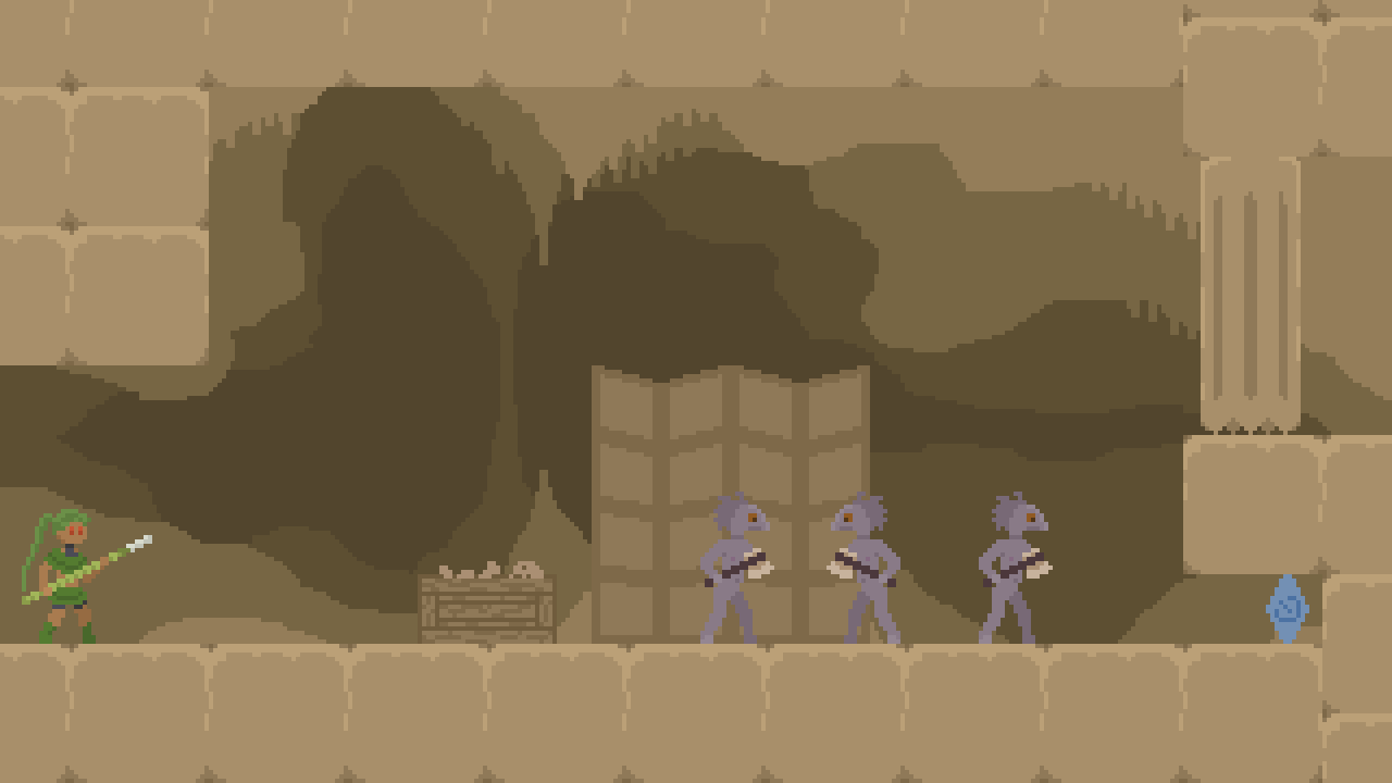
We're throwing you right into the thick of things! This room looks overwhelming, with three enemies right off the bat. However, they usually only fight you one at a time, so if you remain calm it's not too hard.
Fun fact: With the way data is stored for the game, every object in the world needs to have a name. So instead of giving the enemies boring names like "monster1" and "monster2", I gave them names that sound like human names.
Some of the monsters have surprising behavior, but if you're observant, they all reveal what they're going to do ahead of time. You can see Amber going to hide behind the scenery, and Nancy jumping over them, establishing that she likes to jump. However, I expect that no first-time players will have the attention to pay to these while Clyde rushes at them full throttle.
To be honest, I had no idea what species these enemies were supposed to be when I drew them. I just said "Let's give them a goofy looking head and a weird long torso." Multiple players started calling them lizards, so I guess they're lizards now. If I had known they were going to be reptiles, maybe I wouldn't have given them nipples. I was planning to give them raggedy clothes, but I never got around to it before the deadline. Their legs are also identical to the player's legs for the same reason.
My first playtester struggled with this room much more than I intended, so I had to make these enemies a lot easier, mainly by making them jump higher and having more endlag on their attacks. If you're the creator of the game and you already know how to clear a room, it's just about impossible to know how difficult it will be for a first-time player it, which is why playtesting is indispensible.
Another fun fact: If you scramble them right, you can manipulate the monsters into killing eachother by accident. This wasn't entirely intentional, more a consequence of how I programmed the game, with the player and the enemies sharing a base class.
Room 3: Hive
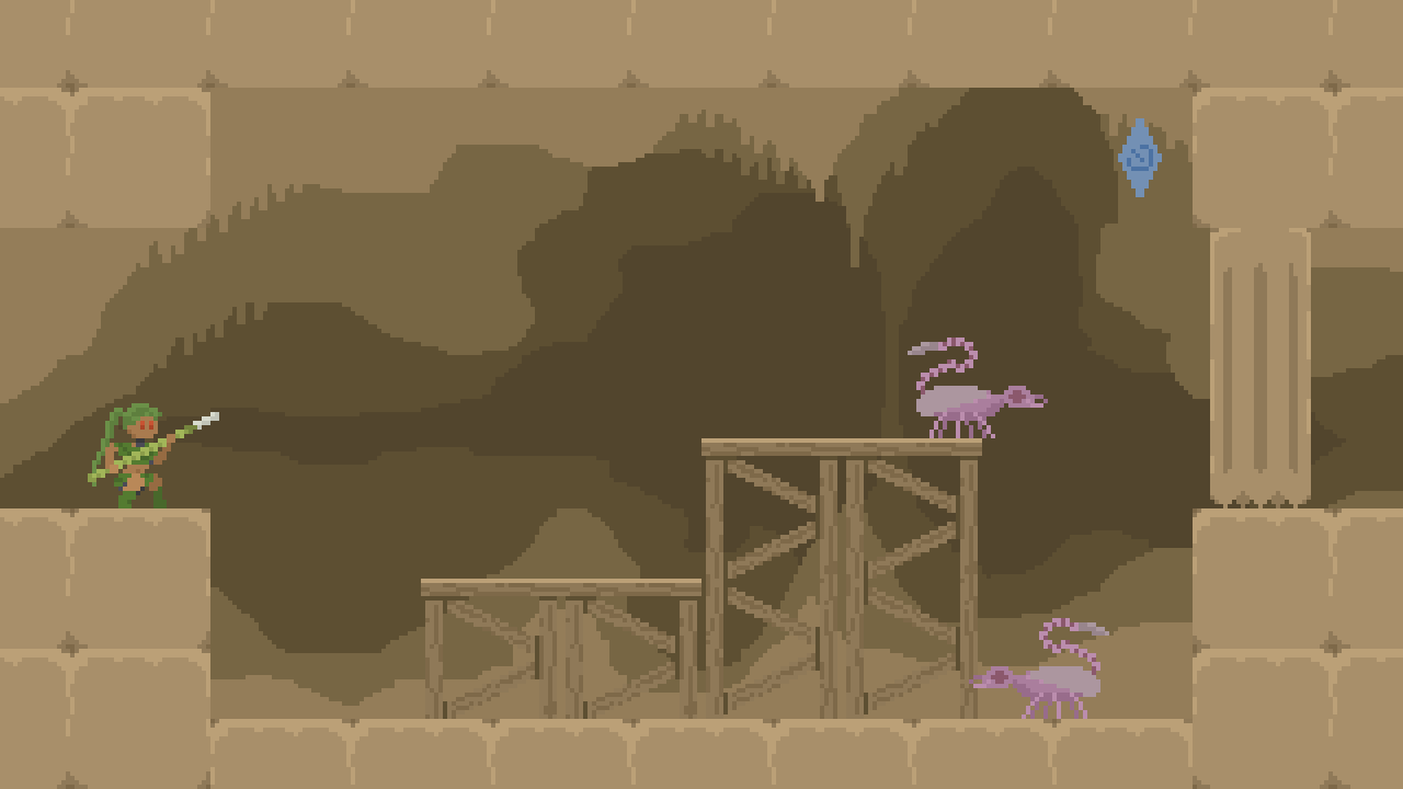
Now we meet everyone's favorite category of enemy: flying things that spit at you!
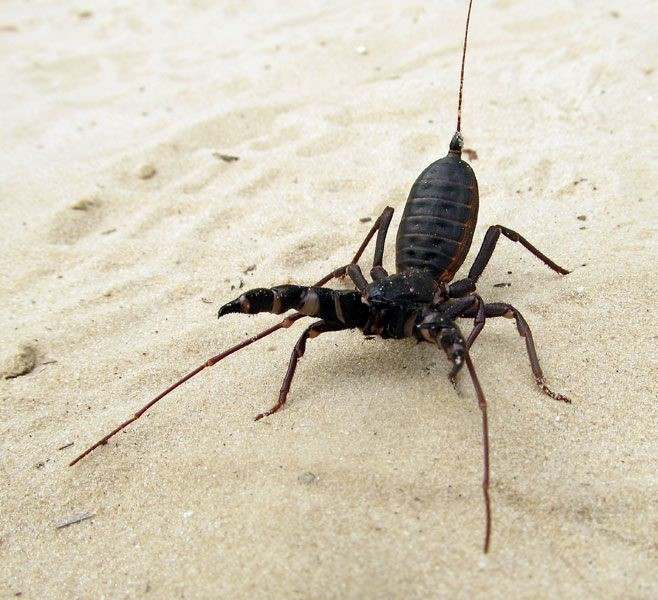
The inspiration for these monsters is the vinegaroon, a relative of the scorpion that can shoot 80% acetic acid (highly concentrated vinegar) from its rear end. However the bugs in this room spit neurotoxic venom out of their mouth instead, and they have wings, which are not found in the arachnid family. And because they fly, they attack from below with their tail, instead of above like real scorpions. They're probably more closely related to wasps, now that I think about it. I considered giving them skinny waspy bodies, but they need a nice fat body so you can stab them more easily.

Contrary to the lizards, I had to make the bugs more difficult after playtesting, because I wanted them to be frustrating but they were too easy. These insects aren't just a nuisance, they have a very important role: to teach the player about the poison mechanic, which is essential to the story later on. To that end, they ought to have good enough aim that a first-time player is almost certainly going to be poisoned at least once by the end of the game.
Did you struggle with defeating the bugs? Here's my advice: aim for their head. Their tail has slightly longer reach than your spear and they predict your movement, so if you rush at them from below, you're very likely to get stabbed. Alternatively, you can wait until they open their mouth to spit, and when they're busy attack them from below (to avoid getting spat upon).
The switches in this room (and in most rooms) are only here to slow you down and force you to contend with the bugs. There aren't any doors in the game that open from defeating enemies, so you can do a "pacifist" challenge if you want to.
Room 4: Corridor

Let's talk about traps. Traps, also called trolls, are traditionally considered bad level design, since they can anger the player by subjecting them to cheap deaths. However, when used occasionally, they can be enjoyable if some or all of the following conditions are met:
- The player knows ahead of time that the game may have traps. In the case of Verdant Fang, the game description mentions "slightly unfair level design".
- Theoretically, the player could have (or feels like they could have) avoided the trap the first time through. In this case, the door closes slowly enough that a wary player should have enough time to react and get out of the way.
- Most importantly, the trap should be amusing or funny to the player, or at least make then feel something. For this, it's a good idea to wait until the player is emotionally invested in the game before springing a trap on them. If you start the game right off with a trap, the player will say "oh it's just a trash game" and go play a different game. It's also worth noting that "funny to the creator" does not imply "funny to the player". It's easy to think of a difficult game as "the creator vs. the player", but just like all games, it's really the creator and player working together to write a story in the player's heart.
It was intentional that dying to the door sends you back to the Hive (with the default checkpoints option), where you have to fight the bugs again. I wanted the player to have as many opportunities to experience poison as possible. On the other side, since this room is annoying to get all the way through, it's important to have a checkpoint right after it, so you only have to do the whole thing once.
The usual sequence of this room requires hitting the switch a total of four times, but if you're swift enough, a number of different things can happen, one of which may end in a surprise!
Room 6: Storage
Do not ask about room 5.
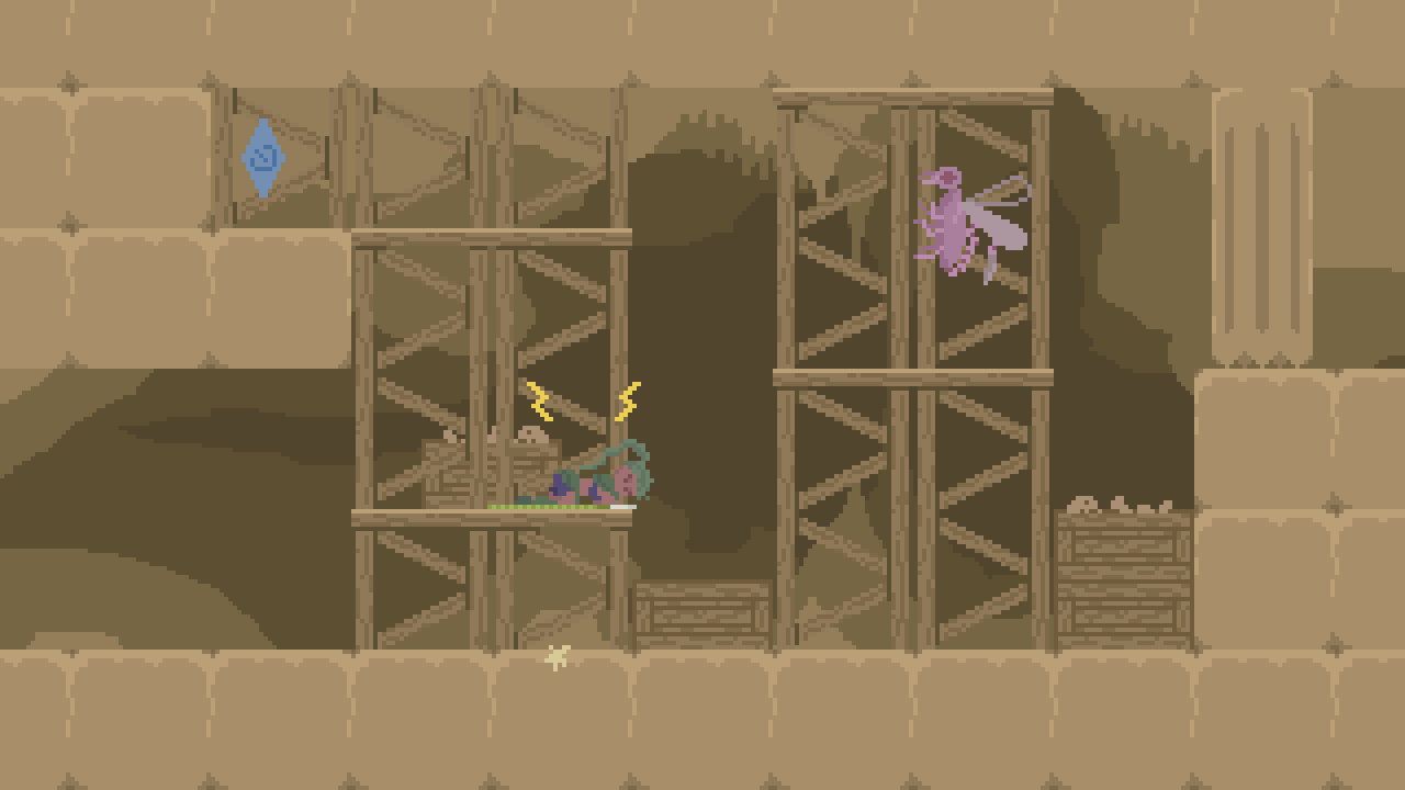
This room is somewhat of a filler room, mainly to give you more chances to get poisoned, and to give more visual variety to the dungeon as a whole. This bug has a slightly different personality from the others, preferring to stay in the same zone and spitting more frequently, though it's hard to notice because only one projectile per bug can be on screen at once.
There isn't much more to say about this room, so let me take this opportunity to point out the room transitions! I'm especially proud of them. They're demure and stay out of the way visually, but they're actually bendy and stripey like a snake. You can also move for a few frames during the beginning and ending of the transition, so it doesn't slow you down as much.

Room 7: Party
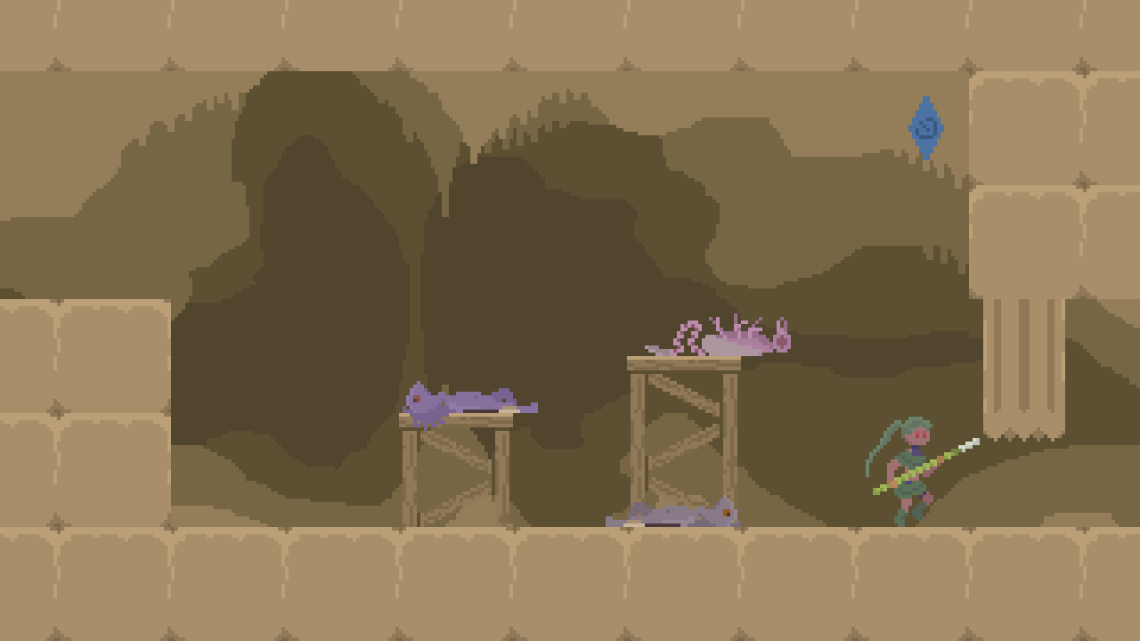
As a sort of climax for the dungeon, here's a penultimate combat challenge with both kinds of enemies. It turned out not all that hard, but when there were more than three enemies it was way too hard. I didn't really have enough time to balance this room properly, but the important thing is that the player feels like they're in a big epic fight. Some players may notice that it's possible for the lizards to be poisoned by the bug's spitballs, and although rare, it's possible to get a lizard to kill the bug.
Room 8: Hallway
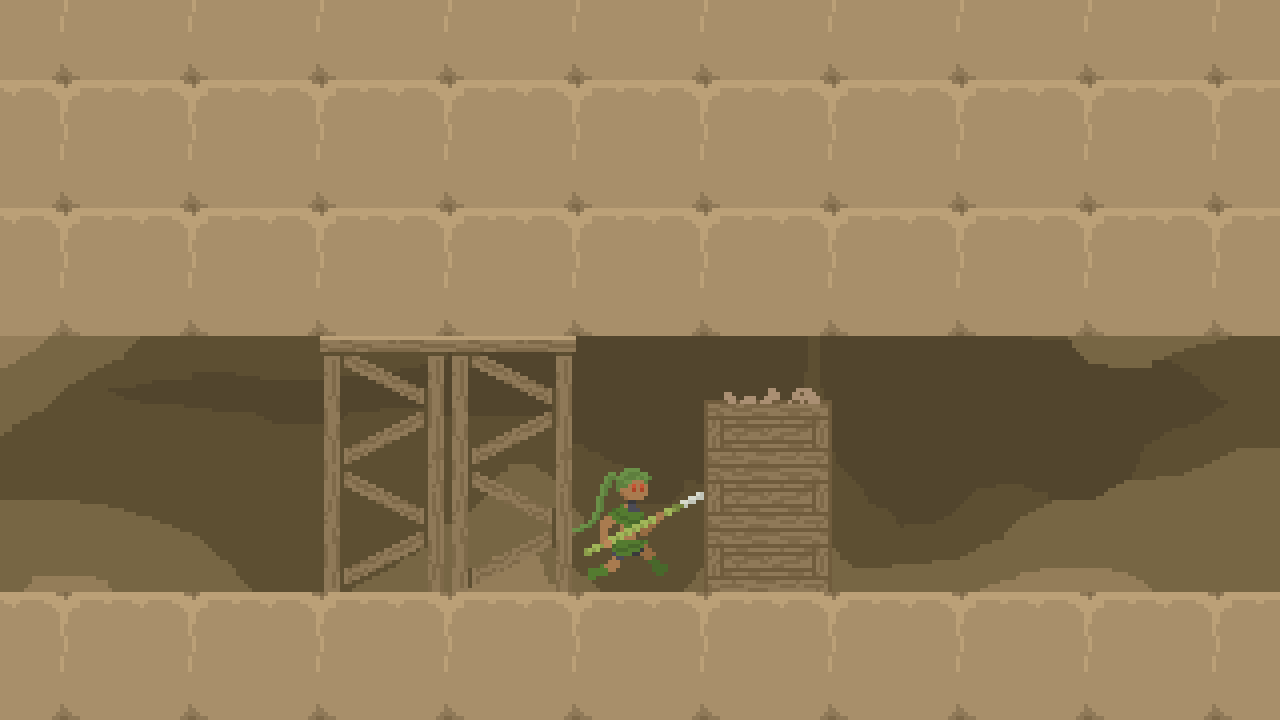
The final hallway before the boss. To make a well-paced game you need to balance action with downtime. That said, I couldn't resist throwing one last trap into this room. Hopefully most players felt like the suspiciously empty hallway was ominous enough that they were still on their guard.
Room 9: Atelier
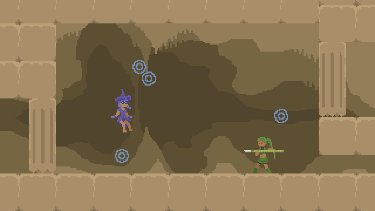
This room is called the atelier because it was going to have scenery resembling a witch's workshop, but I didn't have time to draw any of it. Keep this a secret from everyone else, but I know neither the meaning nor the pronunciation of that word.
This witch's name is Indigo. Don't be deceived by her cute nerdy appearance: she is Very Bad, and likes to derive pleasure from other people's pain and misery, even if she has to cause it herself, consent be damned.
Although I spent around a week on the final cutscenes altogether, the actual boss fight in this room was implemented in a rush over the last two days, competing for time with last-minute bug fixes. So I didn't have a lot of time to balance the difficulty. My playtesters both said that the boss was very hard, but satisfyingly so, and they wouldn't have wanted it any easier, so I went with their opinions. The main thing to get through it is that you have to stop rushing, observe the behavior of the bubbles, and focus on dodging them before popping them (although in the second phase with six projectiles, you may need to pop one or two real quick to have a chance at dodging them all). The movement of the orbs may be unintuitive, but it is still deterministic, so once you learn how they act, you should be able to predict them.
One common problem with fights where you destroy the threats one by one like this is that the fight will start out hard and get easier toward the end. To mitigate this, I made the bubbles get slightly faster as they get fewer. The speedup is subtle enough that you probably didn't notice, but fairly effective at keeping the difficulty steady.
There's a way to cheese this fight, by walking into the room enough for the door to start closing, then running back behind the door before it fully closes. Then when you reenter the room, the door will be permanently open to keep you from getting stuck. If any of the boss's projectiles leave the room through the entrance, they'll be counted as destroyed for the purposes of advancing the fight.
After the fight, a cutscene begins where Indigo breaks your spear and beloved companion, before detaching your arms and legs and absconding with them. Then we have the scene that in my opinion is the main "fetish" point of the game: the struggle of hope against despair. Your partner has been murdered and you are about to die. There is nothing you can do, but still you painfully inch forward, hoping for...something. Maybe there isn't even anything left to hope for, but still you move forward.
That hope is rewarded, but not in a way you could have possibly expected.
By the way, if you do the above exploit where you make the front door to this room permanently open, you can go back to previous rooms after turning into a snake. What happens if you've left some of the enemies alive? I don't know, I haven't tested it. Also, one reviewer discovered that you can fly as a snake by holding the jump button and spamming attack, which is pretty funny.
Room 9.5: Tunnel

I wanted this gameplay section to be longer so you had more time to contemplate your situation and enjoy the title music reprise, but I couldn't really develop it much within the time constraints, so instead you just have a couple switches to hit, to make sure you are aware that you can attack as a snake.
Room 10: Bedroom
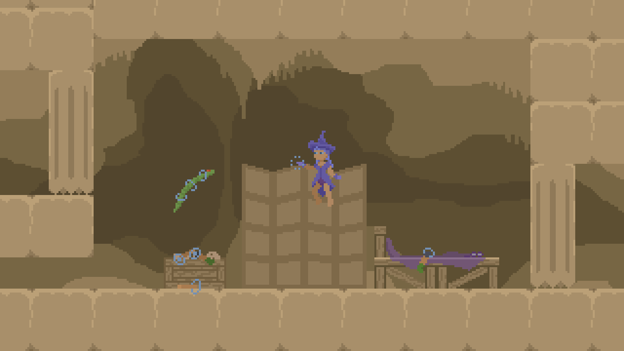
And here's the final room of the game. If you've watched enough snake documentaries, you may see where this is going: snakes lack offense, defense, and speed, so they fight mainly with stealth. A sneak attack, cowardly though it may be, is your only option. And fortunately, your enemy is rather distracted with her trophy from the previous battle. You coil up your body like a spring...and strike!
And she shakes you off like you're no more than a big angry noodle. Then after gathering her wits, she proceeds to capture you again with her magic in order to...and then the venom kicks in. Oh.
And then there's really only one thing left for a good snake to do.
I have a confession: it might be surprising, but I am not particularly into vore. But I find snakes to be quite sexy, and snakes are also quite vore, so...I didn't really have a choice, you see. I based this cutscene on what a snake eating actually looks like—yes, it does look incredibly silly in real life, though maybe not quite this silly. Real snakes can swallow an object that is larger than their head, but here we're consuming something larger than our entire body...just don't question it.


After finishing your meal (for a realistic experience, pause the game and spend a few days digesting), the extra magic energy is enough to revive Fang, who uses magic to return you to human form. You left your clothes back in the other room, but there's no way to go back and get them. Now that you think about it, you could transform back into the clothes you had before the start of the game, but eh, it's too late, the end card is already showing.
Frequently Commented Comments
When I submitted this game as a newcomer to Strawberry Jam, I had no idea how people would react. The response I actually got was so generous and welcoming that it made my heart melt. I wanted to reply in detail to every single comment, but that would have gotten very wordy very quickly. So instead, I'll bundle together a few common themes throughout the comments and write about them here.
"I usually don't have patience for the more difficult style precision games. But it got me hooked enough to get good to figure out how to beat it."
This is one of my favorite types of comments to get! I tried to design this game as sort of a baby version of the hard-as-nails die-a-lot genre, because I think that style of gameplay is really fun, but I don't like the high skill floor and patience that most of those games require. To achieve this, I tried to make sure that all the encounters are learnable, and that nothing strictly requires a high stat in a base skill, such as reaction speed, input timing or visual analysis speed. Improving those skills takes a long time, on the order of days rather than minutes, and many players are unable to improve them beyond a certain point. I also made sure that whenever you come to a new room, you can stop and see what's there to plan your approach, without the enemies swarming you right away.
"I love how intelligent the enemies feel, there were plenty of times when I got shocked at how they act."
It's funny to me whenever somebody praises the enemy AI because when I was writing the AI code I felt like I had no idea what I was doing and was just bumbling through it with all sorts of off-the-cuff estimates and random decisions. But here are some things I did that may or may not have helped:
- Enemies typically do some math to estimate where the player will be when their attack lands, based on position, velocity, and acceleration. Wikipedia's "Equations for a falling body" page was very useful for this. And yes, sometimes this does require the quadratic formula that they tried to teach you in school.
- Enemies have a personality that can be defined separately from their body; for instance some like to rush at you, some like to jump, and some like to hide.
- There are a number of special cases in the code for special situations. A lizard will wait when there is another lizard in front of it. If an insect finds itself above or below the player, it'll move to another location, because being stacked vertically is annoying for both it and the player.
- Enemies take a little bit of time to notice you, and the first enemy to see you reacts a little bit faster. This is only a small touch, but it makes them feel more realistic, like they're actually seeing and reacting to you, instead of just moving automatically like robots.
- I made sure to separate the AI code from the movement code of the enemies, to the point where they're completely separate objects in the world. The interface between them actually uses button controls, just like the player (for the most part; some enemies cheat a little with turning around or initiating cutscenes). For example, the lizard's AI says "If I'm within 28 pixels of the player's predicted position, press the attack button", and the lizard's movement code (which is largely shared with the player's) says "If the attack button is pressed, start an attack animation." If this just gave you an idea about something funny you could do by editing the game data, you are correct! Try it out!
"UNMATCHED foley skills"
I'm going to be honest: I hadn't the slightest idea of how to make sound effects going into this project. I've made sound effects by (ab)using MIDI before, but that didn't feel like it would fit this game. So I just recorded myself making a bunch of noises on my dinky laptop microphone. I probably recorded over a hundred different instances of myself saying "Fwssh! Fwssh!" to get just the perfect attack sound, same with most of the other sounds. I recorded with my laptop unplugged, to minimize the likelihood that its clackety old fan would start spinning. On days when it was raining, it was too noisy in my room so I had to borrow a relative's basement.
My favorite sound is probably the one for hitting a switch. Its filename is "koltik.mp3". My second favorite sound is the door opening sound, "gubuuw.mp3".
"Graphics feel quite unique despite the amount of pixel art entries to the jam."
I'm going to be honest again: the reason I do pixel art is because it's the only kind of art I can do. I don't think of myself an artist, and when working with high-resolution art, the sheer amount of freedom scares me, due to my perfectionist tendencies. With pixel art, however, perfection is possible on small scales: often there are only a handful of different ways you can draw a particular thing, so you can simply try all of them and pick the best one.
Here's a general art tip for people who are scared by art: If you have problems with overwhelming choice, you can narrow those choices down by applying more restrictions to your art. Learning about art theory, color theory, and even storywriting can help expand your repertoire of potential restrictions to choose. Here are some of the restrictions I chose for the art of Verdant Fang.
- Low resolution, i.e. pixel art. I went for a character height of around 32 pixels, which is pretty standard for the genre, and a screen resolution of 320x180, which is much shorter than standard: most retro-style games use 320x240, and even 8-bit and 16-bit games are typically around 256x224. As a result, the player can jump most of the way up the screen, so I couldn't use much verticality in the level design.
- Limited color palette. I tried to get away with as few shades per material as possible: two for most, three for some, and four for rocky things. I didn't have any limits on which colors I chose for the palette though. That was one freedom I felt comfortable with, and I spent quite a while picking some of the colors. One thing I did with this freedom was to make lighter shades less saturated and darker shades more saturated. This gives the overall scene a slightly softer and dustier look. Picking shades with all the same saturations makes things look hard and plasticy.
- No antialiasing. Antialiasing pixel art is hard and I didn't want to do it.
- No outlines. This is probably the most unique graphical choice, since the majority of pixel art games use outlines. Omitting outlines leads to a more simple-looking style, but it's actually harder to design in some ways, since you have to make sure that the characters are visible against all possible backgrounds. It can also be difficult to show depth without outlines. I went with a convention where darker colors mean more depth, and tried to be consistent with it throughout the whole game. If I make different levels with different color schemes, I will probably have to change the character's color palette per-level to look good with the different color schemes.
- No scaling or rotation of sprites. It's impossible to make this look good with pixel art, unless you either use it everywhere (which forces the player's eyes to get used to it), or have a higher resolution for the screen than for the art (which feels like cheating to me). I don't even use any 90-degree rotations in the game, though this is more by accident than choice.
- No smooth color transitions, including screen transitions. I do allow sprites to be tinted (such as during transformation scenes or when you're poisoned), and I did use alpha blending in one place, but I chose not to allow any smooth color transitions over either space or time, since this would introduce a type of smoothness that is not consistent with the rest of the game.
- No moving particles or physically simulated objects. In particular, all blood animations are individual sprites attached to other sprites. As much as I love physically simulated blood, it's very difficult to make it look good without ending up with way too much blood, which ends up looking silly instead of shocking. (Tangentially, it was also intentional to erase the blood when transitioning to the game over screen. Showing violence for too long reduces its shock value.)
- Picking a color language. For example, player-related things are greenish, enemies are purplish, platforms and scenery are yellowish-brownish, and interactible things are blue. Keep in mind that learning art theory doesn't force you to follow its rules. Traditional western art theory says that cool colors make good backgrounds and warm colors make good foregrounds, but I did the opposite here.
Another thing that helps narrow down the possibility space of your artwork is to look at plenty of references, and try to figure out the soul of what you're studying and how that soul comes out through its appearance. For instance, when making the cave background of this game, I drew upon my memories of visiting Oregon Caves, and watched some videos of Mammoth Cave in Kentucky. From this the "soul" that I extracted was chaos and illegibility. Caves aren't made for human traversal. They're made by chaotic geological processes, giving them a mixture of narrow and wide areas, small and large features, and curvy surfaces going any direction except straight. There are still patterns and structures, based on the flow of water that formed the caves, but they're very different from what humans are used to looking at.
With all this in mind, I tried to make the cave look like it's inviting you to venture down into its depths, but it would be weird and inconvenient and you might have to climb up and down a bunch. And since this game is for a jam that's supposed to be about sexuality, I tried to make the general contours somewhat suggestive as well.


"Not the horniest game I've played in the jam but it was a great time."
"It's so stealth I can't quite tell what the exact kinks are."
"Overall the game doesn't feel as sexy as some of the other entries."
It's true that this game doesn't focus too hard on direct sexuality, but in my mind, it's still quite a horny game. I prefer not to think in terms of discrete kinks, but I do find caves, snakes, strong women, danger, blood, frustration, surprise, and the feeling of struggle to all be fairly erotic. I typically don't feel like I can get off directly to adult games, because they're too interactive, so I use them more as inspiration for my imagination for later.
I also was a bit conservative in my handling of sexuality in the game, because the game is also very violent, and I wasn't sure how people interpret itch.io's vague rule against "sexual violence".
It's not documented anywhere else, but the main character's clothing is defined on a separate layer from the body, and if you mess around with the builtin cheat codes, you may find a way to play the game without clothes. Indigo also has her clothing on separate layers (as well as her hat and glasses), though you'll have to edit the world data to change her clothes.
Also, all the image data is in PNG files, so if you want to alter the sprites to fit your preferences, you're free to do so. And if you download the source code, you can open the original XCF file in The GIMP. If you really want to play the game topless and barefoot, or you're that one guy who keeps asking for f**a in every game, here you go. Only a few minutes of work separate your dreams from reality.
Final thoughts
I hope you'll indulge me to talk about myself a little bit. This was the first game, and the first thing at all really, that I've ever made for a large audience. I've attempted to make games before, but only ended up with something that I could show to myself or a few family members, or a dozen colleagues at best. I don't really feel like it's my personality to like...participate in things. So when somebody on the fediverse (who I've sadly forgotten, sorry) shared a link to Strawberry Jam, I just said "oh cool" and kept scrolling.
Later I randomly remembered it, and something in me, I don't know what, said "You can do it! It is possible!" I also had voices saying "You can't do it, you can't do anything", but I've learned to ignore them over the years. So I took a closer look, and this is the metaphorical dialogue that went on in my head:
"Hey what if you actually joined this?"
"It kinda looks like this community is more focused on anthro and animals and stuff, which isn't really my thing."
"That's okay then, you don't have to."
"Alright then."
"But hypothetically...just a thought experiment, hypothetically, if you had to pick an animal that you find the sexiest, what would it be?"
"Snakes, definitely."
And then the ideas starting coming, and they didn't stop coming. So I asked the voice that said "You can do it", I said "Why?", and it said "You know how to code, you know how to write music, you can make pixel art, you have a story with a beginning, middle, and end, and the predicted work, while not easy, fits within a month." Then I turned to the voice that said "You can't do it" and asked it "Why?", and it said "Because you can't do anything, you lost your job and can't get a new one, nothing you start ever finishes. You're going to fail." And I said "What are the consequences if I do fail?" and it said "uh.....I dunno, you'll feel bad about yourself?"
So I did it. It was hard work, and I had to keep pushing myself every day, but in the end, the voice telling me I could do it was correct.
I did have to leave out one of my major ideas due to time constraints: I wanted you to be able to throw your spear into a wall and stand on it, inspired by an extremely obscure Japanese game by the name of Raum. But once I came up with the end of the story, it was clearly the most important part of the game, so I set my focus on it and everything that was necessary to make it work. The entire rest of the game is in service to the ending cutscenes, in a sense.
I also wanted to animate a snake climbing up a pole because it looks really funny, but it was way too complex of an animation for me.
At the beginning of development I had the idea of recording the progress I made every day of the month. This is unusual for me, since I usually hate organization-focused meta-work like that with a burning passion. If you're interested in what it takes to make a game in a month, you can read my daily log by downloading the source code and opening log.md in a text editor or markdown viewer. Maybe I'll post it in another devlog sometime.
"How do you stay motivated to work on a project?"
This is a question that everyone asks at some point, myself included. I don't know if I can give a very satisfying answer. The most important thing is to care about what you're working on, but that alone will not get you through it. Everyone is different so everyone needs different things, but here are some things that helped me:
- Stop doing "inbetween things": things I do to "unwind" but actually drain my energy instead. Mostly YouTube.
- Make sure I'm healthy. For me in particular, my chronic allergies really sap my motivation, so I have to wash my bedsheets frequently. Also, semi-regular exercise is essential for my body to manufacture all the neurotransmitters I need to keep focused and happy.
- Whenever I'm feeling drowsy, brainfoggy, or unwell, take a walk around the block instead of sitting in bed.
- Keep a "sabbath", one day a week where I don't work on my game at all, and try not to even think about it. I ended up getting a lot of housework done on Sundays in order to distract myself from thinking about work.
- Stop believing in "mental tiredness". Physical tiredness is real, and emotional tiredness is also real (maybe), but mental tiredness is a lie told by depression. I don't know if this is actually the case, but it's the kind of thing where believing it tends to make it true.
Bonus: sprite boundary blooper
The image loading system in this game has a feature where it automatically figures out how big sprites are, by finding regions surrounded by transparent pixels. With this, I don't have to manually specify the bounds of every sprite (and the sprites don't have to be laid out in a strict grid). This is very convenient for development, but when it goes wrong and the sprites are just a little bit too close together, you end up with things like this.
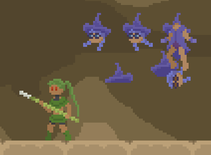
That's all.
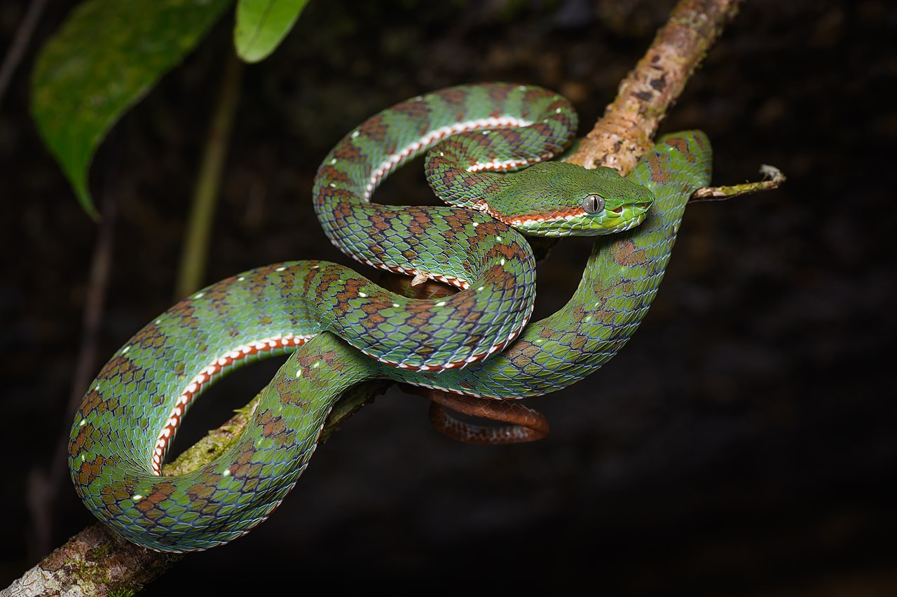
Anyway, I think I've said all I have to say and more, so I won't keep you here any longer. Thank you for reading to the end! Let's finish off with one of my favorite snake pictures.
Get Verdant Fang
Verdant Fang
Short action platformer for Strawberry Jam 8
| Status | Released |
| Author | Leafuw |
| Genre | Action, Platformer |
| Tags | Adult, Erotic, Female Protagonist, Pixel Art, Short, Side Scroller, Singleplayer, snakes |
| Languages | English |
More posts
- New Bonus Content for SupportersMar 19, 2024
Leave a comment
Log in with itch.io to leave a comment.